

 10-08-2014, 09:11 PM
|
#1 |
|
Enthusiast
  Posts: 27
Karma: 74200
Join Date: Oct 2011
Device: none
|
Sony PRS-T Series button design. Do you like?
I like buttons.
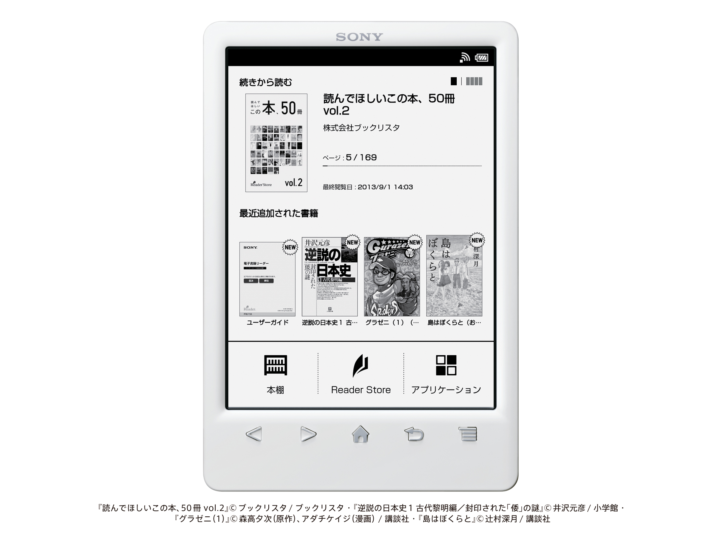
What are your thoughts on the look and feel of the button design on the T series readers (PRS-T1, PRS-T2 and PRS-T3)? http://hq.update.sony.net.edgesuite....0001008205.jpg Sony kept the button design basically the same on no less than 3 generations of units as far as I can tell. Was it the right decision? My dislikes * silver paint on the buttons (paint coatings on plastics that are used frequently wear away eventually). As a general rule, I dislike silver paint and think it always cheapens a product. The idea of making plastics look like metal is a silly one to me. * the fact that the buttons are shaped according to their function instead of being all the same (with their function printed above or below the button instead) * the feel of the buttons under my finger has never felt as good as it should be. Rough. 'Stabby'. Inconsistent. My ideal would be a finger-friendly circular concave or convex button with perhaps one main button (home?) being a different tactile feel (raised dot on it or perhaps concave where others are convex). What are your thoughts on the button design of the T-Series? I am aware Sony won't be making any more 'consumer' e-reader units, but I'm just curious about your thoughts on their design here. If you never thought about the buttons and think I'm insane, well that wouldn't surprise me since I tend to have aversions to the smallest design elements that I think could be improved.  Most of all I'm surprised Sony kept the button design the same over 3 years, because I never felt it was right from the beginning. Your thoughts? |

|

|
|
10-09-2014, 03:10 AM
|
#2 |
|
Fanatic
Posts: 563
Karma: 403106
Join Date: Aug 2014
Device: PRS-T1
|
The button design changed from T1 to T3.
I like the T2/T3 design, T1's not that much (I had to learn them or to read their labels, whereas the buttons of T2/T3 are immediately identified in their function). One has to put the things in their correct frame - which other gear offer metal/aluminium/titanium/spacecraft-alloy for the buttons? Not even the snob-meterring device, ipHone has them. PS: the function of the buttons are doubled by the touch screen. If one wants to reduce their wear, he could use the TS instead. problematic would be only those that do not have an alternative. |
|
|
|
| Advert | |
|
|
|
10-09-2014, 04:05 AM
|
#3 | ||
|
Enthusiast
Posts: 27
Karma: 74200
Join Date: Oct 2011
Device: none
|
Quote:
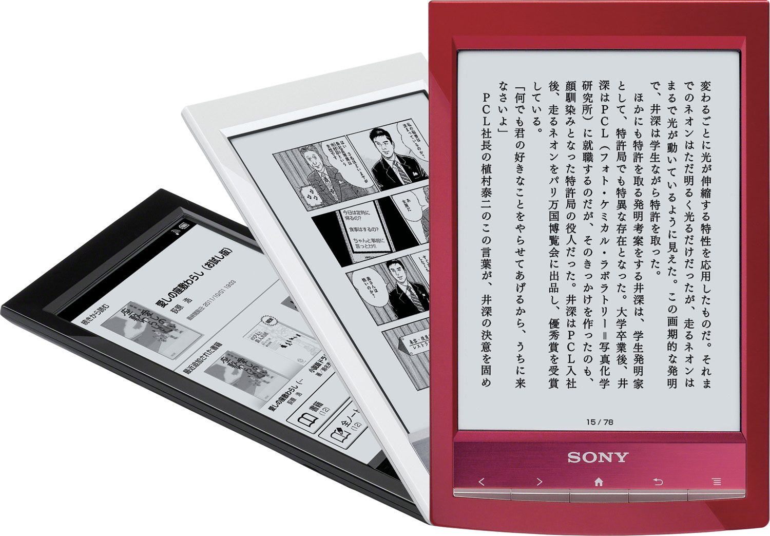
 . I prefer the T1 approach but I'd go for circular concave buttons that are more distinctly separated from each other, not those thin strips. I'd also raise the Sony logo and the icons so your finger doesn't cover the icon for each button so easily. I'd also dispense with what I'm assuming is silver paint on the buttons. . I prefer the T1 approach but I'd go for circular concave buttons that are more distinctly separated from each other, not those thin strips. I'd also raise the Sony logo and the icons so your finger doesn't cover the icon for each button so easily. I'd also dispense with what I'm assuming is silver paint on the buttons.http://hq.update.sony.net.edgesuite....0001004891.jpg Quote:
Last edited by linereader; 10-09-2014 at 04:16 AM. |
||
|
|
|

|
10-10-2014, 05:14 PM
|
#4 |
|
Wizard
Posts: 1,326
Karma: 1077205
Join Date: Jun 2011
Device: Kobo Touch, Sony T1, Kobo Mini
|
Like you I never liked the button design with metal paint. They show wear on my reader much like wear on old well used furniture or hand tool. But this doesn't really bother me. I am always been glad they kept the buttons. Often I use buttons to turn pages instead of touch screen. Back button is easiest way get out of accidentally zoomed in screen.
Absolute worst control on ereader was Kobo 5 way switch with stiff cover that made page turns difficult and came unglued with no easy fix. |
|
|
|
|
10-12-2014, 12:28 PM
|
#5 |
|
Junior Member
Posts: 5
Karma: 10
Join Date: Mar 2014
Device: Sony PRS-T2
|
I have the PRS-T2. I find the arrow-shaped buttons hurt my fingertips after a while.
|
|
|
|
| Advert | |
|
|
|
10-14-2014, 10:03 AM
|
#6 |
|
Lector minore
Posts: 662
Karma: 1738720
Join Date: Jan 2008
Device: Aura One, Paperwhite Signature
|
I thought I would hate the T3 button design but over time I have come to accept them (better than having no buttons at all). I'm starting to think that the shape of the next page button actually makes it a bit easier to press because of the corner.
What I wish though was that click feel was better. I mostly prefer the feel of the buttons on my 505 (except that the navigation buttons were really stiff). And those buttons were actually in aluminium IIRC. I miss that level of reader build quality. If I could put the guts of my T3 into a 505 I'd do it in a heartbeat. |
|
|
|
|
11-10-2014, 10:10 AM
|
#7 |
|
Groupie
Posts: 155
Karma: 1106620
Join Date: Nov 2014
Location: Home of the Maple Leaf
Device: Kobos, iPads, Sonys
|
I find the button placement pretty natural on the T2 as I hold it with my left hand at the bottom of the reader & press the page turn buttons with my thumb. But when using the T3 with the cover, it feels unbalanced this way, and I end up holding it with two hands and swiping the screen to turn pages, making the buttons kind of redundant. I think I've worn down the buttons on the T2 because they feel much smoother than on the T3. The paint hasn't worn off, though.
|
|
|
|
|
11-10-2014, 12:49 PM
|
#8 |
|
Junior Member
Posts: 3
Karma: 10
Join Date: Nov 2014
Device: Sony e-reader
|
Having bought a PRS-T3 a few days ago, replacing the Kobo touch I've had for a number of years, I find the T3 worlds better as an e-reader (Kobo slow and firmware too buggy and the last update essentially trashed it) and, even though I really like having the buttons, they're uncomfortable to use with sharp edges that 'catch' on my fingertips. Would have been better, looks and feel, if the buttons were round and rounded. ..Willy.
|
|
|
|
|
11-10-2014, 06:58 PM
|
#9 |
|
Eudaimonia
Posts: 898
Karma: 9164418
Join Date: Jul 2009
Location: Vancouver, Canada
Device: Sony PRS T2, Sony PRS T3, Sony DPT-RP1
|
I love the buttons. I felt that the silver colour would go away with the use, but, after 2+ years of use my T2 it is still in excellent shape. I don't use it intensively, because of the page turn using a screen swipe, but i still use it regularly to change the page.
|
|
|
|
|
11-11-2014, 04:38 AM
|
#10 |
|
Wizard
Posts: 3,117
Karma: 9269999
Join Date: Feb 2011
Location: UK
Device: Sony- T3, PRS650, 350, T1/2/3, Paperwhite, Fire 8.9,Samsung Tab S 10.5
|
Hurt your fingertips ?
Sharp edges ? Silver paint that might wear off? Want more of a click ? Oh please .... you all need to get out more ....  ( For what it's worth, I think the T3 was the best reader they ever made - with the possible exception of the delightful 350 ! )
|
|
|
|
|
11-11-2014, 01:04 PM
|
#11 |
|
Fanatic
Posts: 563
Karma: 403106
Join Date: Aug 2014
Device: PRS-T1
|
I read a lot but I never thought my fingers will be hurt by the buttons.
|
|
|
|
|
11-11-2014, 06:49 PM
|
#12 | |
|
Wizard
Posts: 3,117
Karma: 9269999
Join Date: Feb 2011
Location: UK
Device: Sony- T3, PRS650, 350, T1/2/3, Paperwhite, Fire 8.9,Samsung Tab S 10.5
|
Quote:
")
|
|
|
|
|
|
11-11-2014, 08:42 PM
|
#13 |
|
350 Hoarder
Posts: 3,587
Karma: 8281267
Join Date: Dec 2010
Location: Midwest USA
Device: Sony PRS-350, Kobo Glo & Glo HD, PW2
|
I don't own any T-series, but I can see the buttons starting to hurt after awhile. Some people just have more sensitive fingers tips than others. While others can carry a bowl filled with hot soup that just feels hot to them, it will burn me and I'll drop it unless I hold the bowl with something. What is a nice hot shower to some actually burns me, and my showers are too cold to them. I can feel roughness to some reader screens, whereas most others think I'm nuts and don't feel it at all.
So I can see it starting to hurt after awhile if they're made of hard plastic. Making them a soft rubbery material would have probably avoided it, only if they used a material that's a solid color throughout and not a surface-coated color that will wear off in time (like Logitech remotes for instance for me). Yes, I'm also picky enough that I would hate to see buttons with half worn-off coloring to them. 
Last edited by Ripplinger; 11-12-2014 at 12:41 AM. |
|
|
|
 |
«
Previous Thread
|
Next Thread
»
|
 Similar Threads
|
||||
| Thread | Thread Starter | Forum | Replies | Last Post |
| Ended Oberon Design Classic Nook Cover (Green Celtic Hounds Design) | apastuszak | Flea Market | 2 | 12-12-2011 09:11 AM |
| Book in Calibre Series is not being added to collection in Sony PRS 300 | Sean0 | Devices | 6 | 08-14-2011 12:57 PM |
| Oberon Design Leather covers available for the PRS 700 (and 505) | sayhello | Sony Reader | 3 | 07-16-2009 03:25 AM |
| Old news: Sony PRS-505 wins international red dot design award - 2008 | Wetdogeared | News | 0 | 06-20-2009 09:51 AM |
| Amazon Kindle/Sony PRS-700/Sony PRS-505 Comparison Photos | chrissy | Which one should I buy? | 18 | 05-06-2009 12:25 PM |
All times are GMT -4. The time now is 10:54 AM.