

 11-12-2014, 10:05 AM
|
#211 |
|
Connoisseur
  Posts: 75
Karma: 81904
Join Date: Sep 2014
Device: multiple
|
I didn't remove the headers, I get more text on the H20 than the Voyage, same font size, for what it's worth. I will probably remove the header at some point to get even more text on there, just been too lazy to patch it, and eventually Kobo may make it an option with a firmware update anyway. I've grown to like the footer, having an accurate number of pages left in a chapter somehow clicks with me. To me, it's the extra width of the H20 that's so darned nice, it feels more like a page from a book, on the Voyage, it feels more like a newspaper column.
Karter, I have the refresh to every page, and I have the font weight somewhere between default and 100%, I don't have it turned all the way up, using Caecilia or whatever it is. I have no graying of the letters, try that and see how it looks. Personally, comparing the screens next to each other at roughly equal lighting, the H20 looks much, much better IMHO--more natural, less electric looking. I'm keeping the Voyage--I've given my paperwhite 1 and 2 to my kids over the years, and kept an old basic kindle (which I liked better than the paperwhites, the screen was sharper, blasphemy, I know). But the Voyage is so much better than the Basic that I'm hanging on to it--it's really the ultimate in portability. At home though, it's the H20 hands down. |

|

|
|
11-12-2014, 10:05 AM
|
#212 | |
|
dangerous when cornered
Posts: 1,865
Karma: 22891237
Join Date: Dec 2011
Location: USA
Device: Kobo H2O, Kobo Libra 2, Kindle Paperwhite
|
Quote:
 I applied the patch on mine, but on a side note, for those that don't want to use a patch, there are other quick changes you can make to remove the extra space. I applied the patch on mine, but on a side note, for those that don't want to use a patch, there are other quick changes you can make to remove the extra space. 
|
|
|
|
|

| Advert | |
|
|
|
11-12-2014, 01:52 PM
|
#213 |
|
Connoisseur
Posts: 75
Karma: 81904
Join Date: Sep 2014
Device: multiple
|
Is there a way to remove the header on Kpubs (ie through Calibre) other than with the patch?
|
|
|
|
|
11-13-2014, 07:21 AM
|
#214 |
|
Junior Member
Posts: 8
Karma: 10
Join Date: Oct 2014
Device: H2O
|
Thanks cct1. I will try. I just wanted to know whether it is normal or not, just to know if I have to return it to the shop and get another one without that problem (since I have a limited time to do that). So, that graying of the letters is normal when not modifying the default refresh rate and font weight? (The graying isn't exact on every letter, it depends on where the letter is located). Thanks again
|
|
|
|
|
11-13-2014, 09:02 AM
|
#215 | |
|
Connoisseur
Posts: 75
Karma: 81904
Join Date: Sep 2014
Device: multiple
|
Quote:
|
|
|
|
|
| Advert | |
|
|
|
11-14-2014, 12:29 AM
|
#216 |
|
Enthusiast
Posts: 45
Karma: 2772
Join Date: Mar 2009
Device: Kobo H2O
|
So I've seen many comparisons photos of these two devices but they don't reveal much to me. Most of the photos suffer from lack of sharpness, blur from hand-shake, noise from high ISO or inaccurate White Balance.
Can anyone comment on how do they perform with serif fonts? Does the higher pixel density of the Voyage make a big difference? |
|
|
|
|
11-14-2014, 10:05 AM
|
#217 |
|
Connoisseur
Posts: 75
Karma: 81904
Join Date: Sep 2014
Device: multiple
|
Can't comment on Serif, but the higher pixel density of the Voyage is outweighed by the ability to increase the weight of the fonts on the H20 IMHO; the letters look better/clearer (to me at least) on the H20 with the font weighted to my preferences.
|
|
|
|
|
11-14-2014, 12:30 PM
|
#218 | |
|
Wizard
Posts: 3,472
Karma: 48036360
Join Date: Aug 2009
Location: where the sun lives, or so they say
Device: Pocketbook Era, Pocketbook Inkpad 4, Kobo Libra 2, Kindle Scribe
|
Quote:
|
|
|
|
|
|
11-14-2014, 12:32 PM
|
#219 | |
|
Fervent Pleasure Seeker
Posts: 1,224
Karma: 712073
Join Date: Feb 2009
Location: The Windmills of My Mind
Device: Clara HD
|
Quote:
ETA - the KV screen did make the type appear very crisp and contrasty, however. That was good. Last edited by pghaworth; 11-14-2014 at 12:38 PM. |
|
|
|
|
|
11-14-2014, 12:46 PM
|
#220 | |
|
dangerous when cornered
Posts: 1,865
Karma: 22891237
Join Date: Dec 2011
Location: USA
Device: Kobo H2O, Kobo Libra 2, Kindle Paperwhite
|
Quote:
I actually prefer the way the fonts look on my PW2 and far prefer how they look on the H20, especially since you can change the weight of the fonts and the light is much more natural to my eyes as well. So that was my personal experience. The only way to really know how you'll find it is to try the different devices yourself. If you're in the states, you can easily compare the PW2 2014 to the voyage demo in Best Buy.
|
|
|
|
|
|
11-14-2014, 01:06 PM
|
#221 | |
|
Fervent Pleasure Seeker
Posts: 1,224
Karma: 712073
Join Date: Feb 2009
Location: The Windmills of My Mind
Device: Clara HD
|
Quote:
 
|
|
|
|
|
|
11-15-2014, 01:52 AM
|
#222 |
|
Enthusiast
Posts: 45
Karma: 2772
Join Date: Mar 2009
Device: Kobo H2O
|
Thanks for the replies everyone!
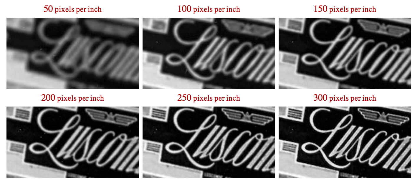
It seems like the advantage of higher pixel density on the Voyage is negated by the limited customisation on the Kindle. I suppose that can solved by modifying the e-books but it's not something I'd do. Unfortunately, it's highly unlikely I'd get to demo them at all in Australia. It'd be interesting to see the differences with both readers using the same font, size and weight. LCD pixel density comparison: http://www.mrgeek.me/wp-content/uplo...-50-to-300.png |
|
|
|
|
11-15-2014, 03:19 AM
|
#223 | |
|
eBook Enthusiast
Posts: 85,560
Karma: 93980705
Join Date: Nov 2006
Location: UK
Device: Kindle Oasis 2, iPad Pro 10.5", iPhone 6
|
Quote:
The other features of the Voyage make it a winner for me: the page turn buttons, and the much more accurate touch-screen. Last week I was reading a book on my H2O which had a lot of endnotes, and trying to activate the small hyperlinks for the notes was extremely frustrating - I had to tap the screen time after time before the link would work. Most of the time it just turned the page. That just doesn't happen on the Voyage. |
|
|
|
|
|
11-15-2014, 01:04 PM
|
#224 | |
|
Fervent Pleasure Seeker
Posts: 1,224
Karma: 712073
Join Date: Feb 2009
Location: The Windmills of My Mind
Device: Clara HD
|
Quote:
|
|
|
|
|
|
11-15-2014, 03:55 PM
|
#225 | |
|
Bibliophagist
Posts: 51,384
Karma: 179640714
Join Date: Jul 2010
Location: Vancouver
Device: Kobo Sage, Libra Colour, Lenovo M8 FHD, Paperwhite 4, Tolino epos
|
Quote:
|
|
|
|
|
 |
| Tags |
| kindle, kobo, voyage |
«
Previous Thread
|
Next Thread
»
|
 Similar Threads
|
||||
| Thread | Thread Starter | Forum | Replies | Last Post |
| Kobo Aura H2O covers | Josieb1 | Kobo Reader | 628 | 08-01-2020 01:44 PM |
| My Kobo Aura H2O review unit arrived | Nate the great | Kobo Reader | 150 | 05-20-2015 07:33 AM |
| Aura H2O Review | dieterpops | Kobo Reader | 89 | 04-10-2015 07:28 PM |
| Kobo Aura H2O Officially Announced | tnforpaul45 | Kobo Reader | 306 | 10-03-2014 03:55 PM |
| Kobo Aura H2O eReader Clears the FCC | Nate the great | News | 0 | 08-18-2014 10:03 AM |
All times are GMT -4. The time now is 04:07 AM.