View Single Post
Old 11-27-2012, 10:42 PM   #30
buffaloseven
Watching the Sky
buffaloseven ought to be getting tired of karma fortunes by now.buffaloseven ought to be getting tired of karma fortunes by now.buffaloseven ought to be getting tired of karma fortunes by now.buffaloseven ought to be getting tired of karma fortunes by now.buffaloseven ought to be getting tired of karma fortunes by now.buffaloseven ought to be getting tired of karma fortunes by now.buffaloseven ought to be getting tired of karma fortunes by now.buffaloseven ought to be getting tired of karma fortunes by now.buffaloseven ought to be getting tired of karma fortunes by now.buffaloseven ought to be getting tired of karma fortunes by now.buffaloseven ought to be getting tired of karma fortunes by now.
 
buffaloseven's Avatar
 
Posts: 234
Karma: 634112
Join Date: Sep 2012
Location: Winnipeg, MB
Device: Kobo Aura
Quote:
Originally Posted by jackie_w View Post
Yes those were my observations with my ArnoPro fonts that I like a lot on my Sonys. Some of the thinner parts of each character's strokes almost disappear at my preferred font size. It has that 'inkjet-printer-starting-to-run-out-of-ink' look. The Charis SIL fonts I have look good on the Glo.

On the whole, for me, the Glo built-in serif fonts are pretty good. I'm a bit undecided on Kobo Nickel, though. I do like to vary fonts to give each new book a different feel from the previous one.
I've been relatively unsatisfied with the serifed fonts. Kobo Nickel I would like if it had greater x-height; as it stands now it looks rather squashed to me.

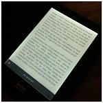
My favorite font I've put on so far is definitely Iowan Old Style, which is nicely weighted, sharp, an just generally great looking on the Glo (which is odd, because it's not my favorite font on other types of screens). I've attached a picture showing Iowan Old Style.

Click image for larger version

Name:	ImageUploadedByTapatalk1354074137.218346.jpg
Views:	800
Size:	142.6 KB
ID:	96925
buffaloseven is offline   Reply With Quote