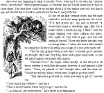
i've been looking at the adobe sample ebook of Alice in Wonderland (attached). in chapter 6, they've managed to reflow text around a non-rectangular image :
i've been wanting to figure out how to do that for ages and it turns out it's laughably easy. here's the code :
Code:
<p><div style="float:left;max-width:170px;width:8.5em;text-align:left;
margin:0.25em 0px 0.25em 0.25em">
<img style="display:block;max-width:342px;width:17em;"
src="images/alice23a.gif" alt="Alice talks to Cheshire Cat"/>
</div>
<div style="float:left;max-width:170px;width:8.5em;max-height:220px;
height:11em;margin:0.25em 0.25em 0.25em 0px"/>
  So she set the little creature down, and felt quite relieved to
see it trot away quietly into the wood.
(...)
when she was a little startled by seeing
the Cheshire Cat sitting on a bough of a tree a few yards off.
</p>
open a paragraph. create 2 floated divs.
div 1 : define the width** as the width of the narrow leg of the image. place the image inside the div, and define the img width** as the actual width of the entire image.
div 2 : define the width** as the actual width of image, and define the height as the height of the wide part of the image. this div is an empty placeholder.
place text in paragraph following divs.
**notice the width is given as max-width in pixels (actual size of the image) and also in ems ; this allows the images to be resized with the text if text size is enlarged or reduced.
the 2 divs stack on top of each other and the text wraps around them, first the wide one, then the narrow one. the image overflows its narrow div and is visible beside the text.
this will work for left or right side images (just define the float accordingly) with a shape of an upside down L. i imagine it should be possible to make it work for an image with the large bit on the bottom (like a right side up L) but i've not yet tried it out. maybe it would take a third narrow div and add a "clear" to the wide one, to push the wide one down... there might even be other ways to use this idea.