Quote:
Originally Posted by Doitsu

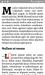
The Kindle Previewer display isn't always accurate. I've attached a KFX file generated with the Calibre KFX Output plugin and a screenshot taken with my Paperwhite 2. |
Hi Doitsu;
Your output is like my Kindle for Android but a bit better because the app for tablets and smartphones, it shows the dropcap with the em-dash more tiny. Yes, the Kindle Previewier is not relliable but the file generated with the KFX Output plugin is based on Kindle Previewer. And you can see how it looks the file in my smartphone:
As you can see, the second drop cap has a different size than the first one. And also is that gap (the red rectangle in the picture) that I can't close, I don't know how to do it (a class with negative margin doesn't work).
And your output also says me that things are still more complicated than what I thought. The .kfx generated shows different outputs in Kindle devices and in Kindle for Android (and I afraid of the same things occurs in Kindle for IOs). Would it be possible to build a consistent output?

(In theory, .kfx was designed for that).
Quote:
|
The second drop cap doesn't look perfect, though. However, it's relatively rare to have characters other than a quotation mark before a drop cap.
|
In spanish, you can find before a drop cap, an "em" dash (for dialogs), an "em" dash and an open question mark (—¿Qué me dices?), an "em" dash and an open exclamation mark (—¡Qué dices!), and french quotations marks («). In english is easier
Regards
Rubén
EDIT: And in Kindle for Android, in a tablet (in a smartphone things are different, maybe the Android version has relation with this), when you change fonts, the drop cap remains with Bookerly, but the drop cap with the dash, is afected for the new font and not always its position is like the original with Bookerly.