Quote:
Originally Posted by frabjous

I seem to remember ADE having a problem whereby it would oblique-ify already italic fonts if they're set as font-style: italic;, resulting in an ugly mess--is my memory off on that?
|
You certainly frightened me there, but it seems this is not the case, thankfully. Here's a line from a book which has Bodoni Twelve OS Book Italic embedded and defined as font-style: italic.
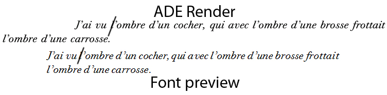
It doesn't look as if ADE is adding any extra angle to the axis, at least in the desktop version. I think you should be safe using standard italic as a fall-back for readers that take the short bus to school, like iBooks (hopefully this was a result of rushing the hardware out before having the OS properly in place and version 4 will fix it).
I hadn't anticipated the problem with line endings. I don't think it looks too bad in the context. You could probably fix it by manipulating the font using the kerning table instead of the sidebearings, so that extra space would be inserted between letters but not between a letter and a space and the size of the letter would remain unchanged. This would be a
lot of work though, and you'd have to trust that the reader software will use the kerning table properly.