View Single Post
Old 03-03-2010, 12:31 AM   #43
frabjous
Wizard
frabjous can solve quadratic equations while standing on his or her head reciting poetry in iambic pentameterfrabjous can solve quadratic equations while standing on his or her head reciting poetry in iambic pentameterfrabjous can solve quadratic equations while standing on his or her head reciting poetry in iambic pentameterfrabjous can solve quadratic equations while standing on his or her head reciting poetry in iambic pentameterfrabjous can solve quadratic equations while standing on his or her head reciting poetry in iambic pentameterfrabjous can solve quadratic equations while standing on his or her head reciting poetry in iambic pentameterfrabjous can solve quadratic equations while standing on his or her head reciting poetry in iambic pentameterfrabjous can solve quadratic equations while standing on his or her head reciting poetry in iambic pentameterfrabjous can solve quadratic equations while standing on his or her head reciting poetry in iambic pentameterfrabjous can solve quadratic equations while standing on his or her head reciting poetry in iambic pentameterfrabjous can solve quadratic equations while standing on his or her head reciting poetry in iambic pentameter
 
frabjous's Avatar
 
Posts: 1,213
Karma: 12890
Join Date: Feb 2009
Location: Amherst, Massachusetts, USA
Device: Sony PRS-505
A lot of the time, I wish I didn't even know about the existence of ligatures.

At least with the fi/fl/ffl/ffi/ff ligatures, most of my life, I didn't even notice they were there when they were there, and didn't notice when they were gone. It's only when I started investigating why it is I found LaTeX output subtly better than MS Word output without really realizing why that I learned about such things.

Now of course, I'm cursed to noticing both their presence and their absence, and both are little distracting. Good typography of course is invisible typography, and normally it would be--I've basically made by own book reading experience worse by picking at it.

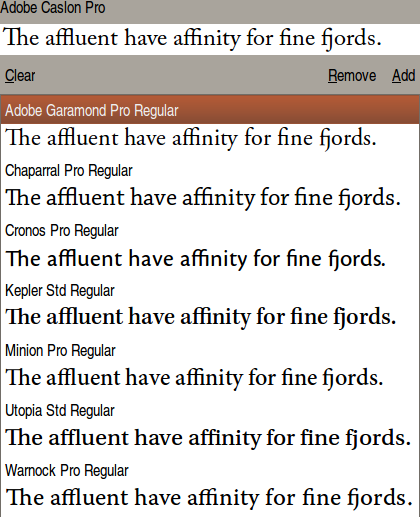
Generally, however, I think the inclusion of ligatures looks nice, but there is one exception: I've noticed that a lot of "Pro" fonts like Adobe Garamond Pro and Minion Pro, etc., have "Th" ligatures, which for some reason, just seem over the top to me.

Attached Thumbnails
Click image for larger version

Name:	Th-lig.png
Views:	1037
Size:	62.7 KB
ID:	46995  
frabjous is offline   Reply With Quote