View Single Post
Old 10-30-2009, 10:24 AM   #3
zelda_pinwheel
zeldinha zippy zeldissima
zelda_pinwheel ought to be getting tired of karma fortunes by now.zelda_pinwheel ought to be getting tired of karma fortunes by now.zelda_pinwheel ought to be getting tired of karma fortunes by now.zelda_pinwheel ought to be getting tired of karma fortunes by now.zelda_pinwheel ought to be getting tired of karma fortunes by now.zelda_pinwheel ought to be getting tired of karma fortunes by now.zelda_pinwheel ought to be getting tired of karma fortunes by now.zelda_pinwheel ought to be getting tired of karma fortunes by now.zelda_pinwheel ought to be getting tired of karma fortunes by now.zelda_pinwheel ought to be getting tired of karma fortunes by now.zelda_pinwheel ought to be getting tired of karma fortunes by now.
 
zelda_pinwheel's Avatar
 
Posts: 27,827
Karma: 921169
Join Date: Dec 2007
Location: Paris, France
Device: eb1150 & is that a nook in her pocket, or she just happy to see you?
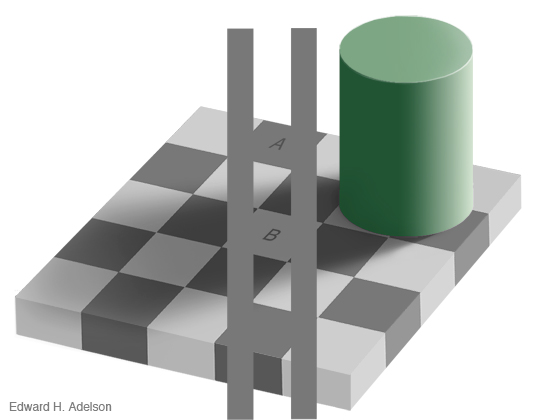
hi sébastien, i think you'll get a lot of different answers to your question. personally i always prefer dark coloured cases because i think it makes the screen appear lighter, through an optical illusion. you can see a demonstration of that effect here :

the squares A and B are the same colour :
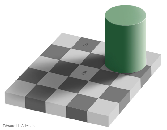


demonstration :


(of course, other people may argue instead that a light colour case will make the text appear darker. )

i think it's mostly a question of personal preference. i have experience with black and red cases and neither one of them is distracting to me at all, in fact i don't notice them at all while i'm reading (even the red one !).
zelda_pinwheel is offline   Reply With Quote