One of the users on another forum (
source) has just posted some comparison pictures of Kindle 2, Kindle 3 and Kindle Paperwhite on-screen fonts, zoomed in. Pictures are shown respectively.
While the higher resolution is clearly visible, what surprised me is the looks of PW font edges, their blurriness, like the actual text is submerged into water, and that we look at it through some kind of a water layer...?
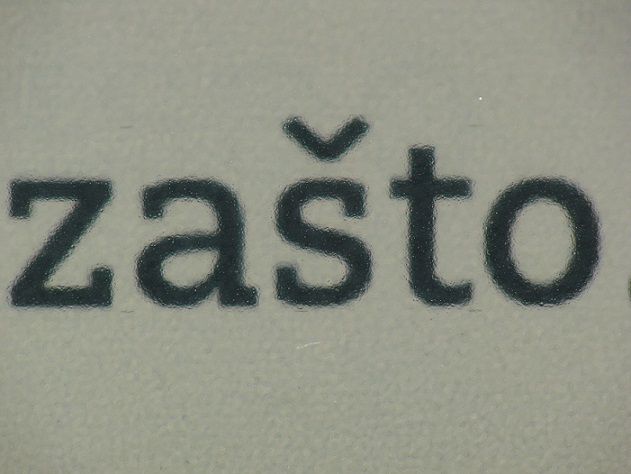
I haven`t seen this on pictures posted so far, anyone else noticed it? K2 and K3 pictures have clear pixelization, but I don`t think that`s the issue with PW, where the edges are rather smudged then pixelized :/
As the user mentioned there, this is probably because of the light diffusing layer above the eInk screen, and probably the touch layer has its part in it, too. He also states that all this is practically impossible to see in regular use. But, it might be (one of) the reason(s) why some people say that fonts are not as clear on PW as on the previous generation Kindle.
edit: I just read this post, that is exactly what I was talking about
:
Quote:
Originally Posted by Binko

Also there is the effect of looking through the additional layer of plastic that is used for light dispersion. All in all, the fonts are no where near as sharp as I had hoped.
|