Having said all that, I went and looked a bit closer. And you're right, there definitely are fonts that have problems with a leading of 1.2, especially when dealing with capitals with diacritics, which I hadn't considered previously.
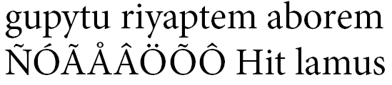
A well-behaved font like Minion handles these just fine, without allowing the diacritical marks to collide with descenders (all pics with a leading of 1.2em):
But fonts that are designed to work at really small sizes can make compromises with their heights that cause bad results:
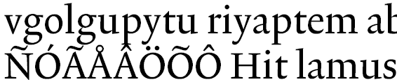
which looks a bit nasty. It seems self-defeating to design a font to allow people to cram as much text into as small a space as possible and then include things like this which will force the typographer to increase the leading, but there you go.